07 / Brand identityEnergy markets

A visual system for a new kind of energy.
Sesco uses deep market insight and quantitative analysis to support a more efficient and reliable power grid.
ProjectSesco
My roleVisual direction and brand system
ScopeColor, logo, typography, collateral, guidelines
WithSesco
The point of view
Making complex energy expertise feel clear, modern, and alive.
I created a visual direction that could hold the complexity of Sesco's work without making the company feel cold or overly technical. The system needed to communicate intelligence, movement, and trust.
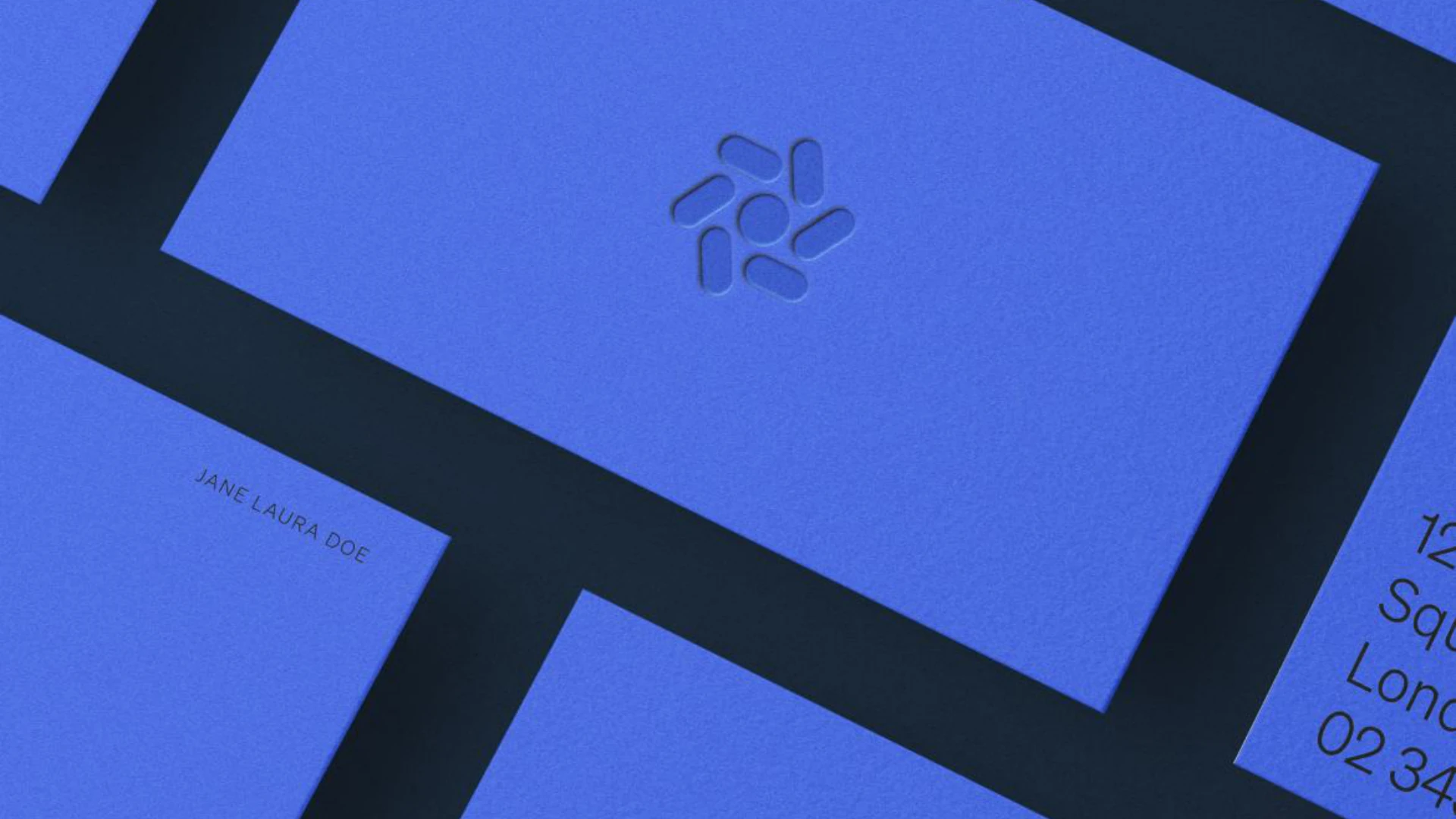
Volt blue carries the energy of the brand. Midnight gives it depth, while pale sky tones and warm orange create room for expression.
Bringing a new type of energy to town.

The system / 02
One clear signal, with room to flex.
The mark / 03
Built from movement.
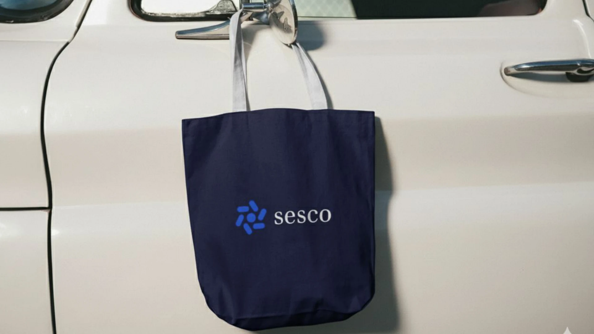
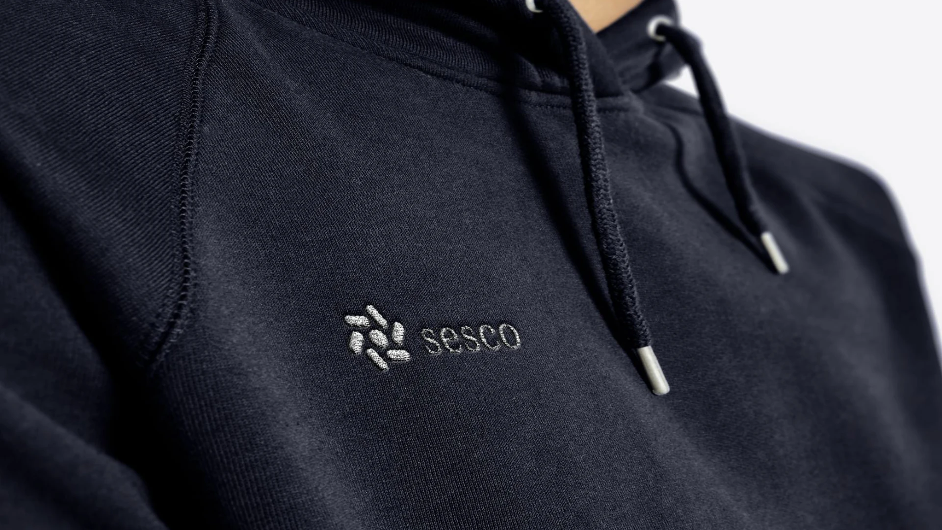
The mark borrows its rhythm from a wind wheel and the flow of electric current. It stays recognizable from a small app icon to a full wordmark.
Small

Medium
 Lockup
Typography / 04
A calm voice for technical ideas.
Market insightReliable power,
clearly expressed.
clearly expressed.
From detailed analysis to everyday communication, the hierarchy keeps dense information open and easy to follow.